Senior Product Designer | Enterprise SaaS
Platform & Timeframe
Web application
June to August 2023
Role & Team
First Lead UX/UI Designer and Researcher working with 24 team members:
24 members, including engineers, TPMs, PMs, and SME
Note
To comply with my non-disclosure agreement, I have omitted and obfuscated confidential information in this case study. The information in this case study is included in my research report and does not necessarily reflect Welbilt (a subsidiary of Ali Group) & Ali Group.
THE BACKGROUND

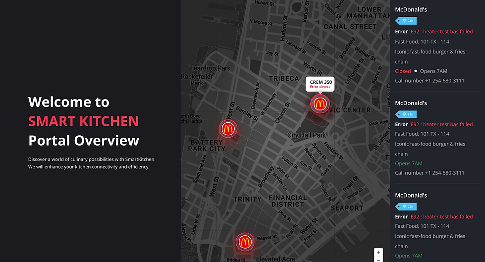
Prime User: Kitchen Operation Manager at McDonald's and other restaurant chains
The Product:
AI Kitchen Cloud, SaaS
Role: First Lead UX Designer hired to revamp Welbilt’s commercial kitchen equipment management platform, leading the end-to-end redesign of their digital ecosystem to solve critical usability and operational challenges.
User Pain Points?
-
Tracking equipment issues felt like searching for a needle in a haystack
-
Information was scattered, hard to find, and poorly structured
PAIN POINTS
Prioritizing the most important things to fix

The red box highlights a summary of the user story from the chart above. There were numerous potential areas within the product to explore.
To kick off the project, I conducted a comprehensive study of the product, its customer base, key kitchen equipment brands, and overarching business objectives.
Given the wide range of opportunities, I collaborated with the Product Manager to narrow the scope and prioritize the most pressing user pain points.
For this case study, I’ll focus specifically on the Smart Tag feature and software updates
THE PROBLEM
Why it matters?
User: Inefficient tracking information led to delays, lost revenue, and frustrated kitchen teams
Business impact: Delayed issue resolution led to operational inefficiencies and financial losses


BUSINESS GOAL
What is the UX goal?
User: Redesigned the Smart Tag Management System to improve intuitiveness, speed, and traceability.
Business Goal:
Reduce downtime of kitchen equipment
Improve operational efficiency
BREAKING DOWN THE PROJECT
The product was extremely hard to use
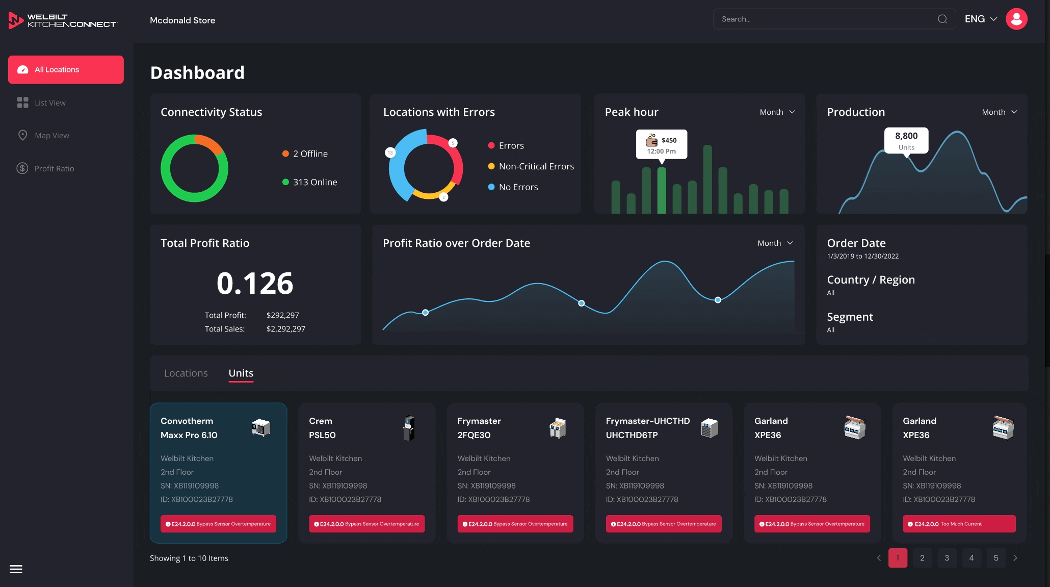
What is SmartTag?
A smart tag acts like a digital assistant for your kitchen equipment. It tracks important details like maintenance schedules, performance data, and error logs.
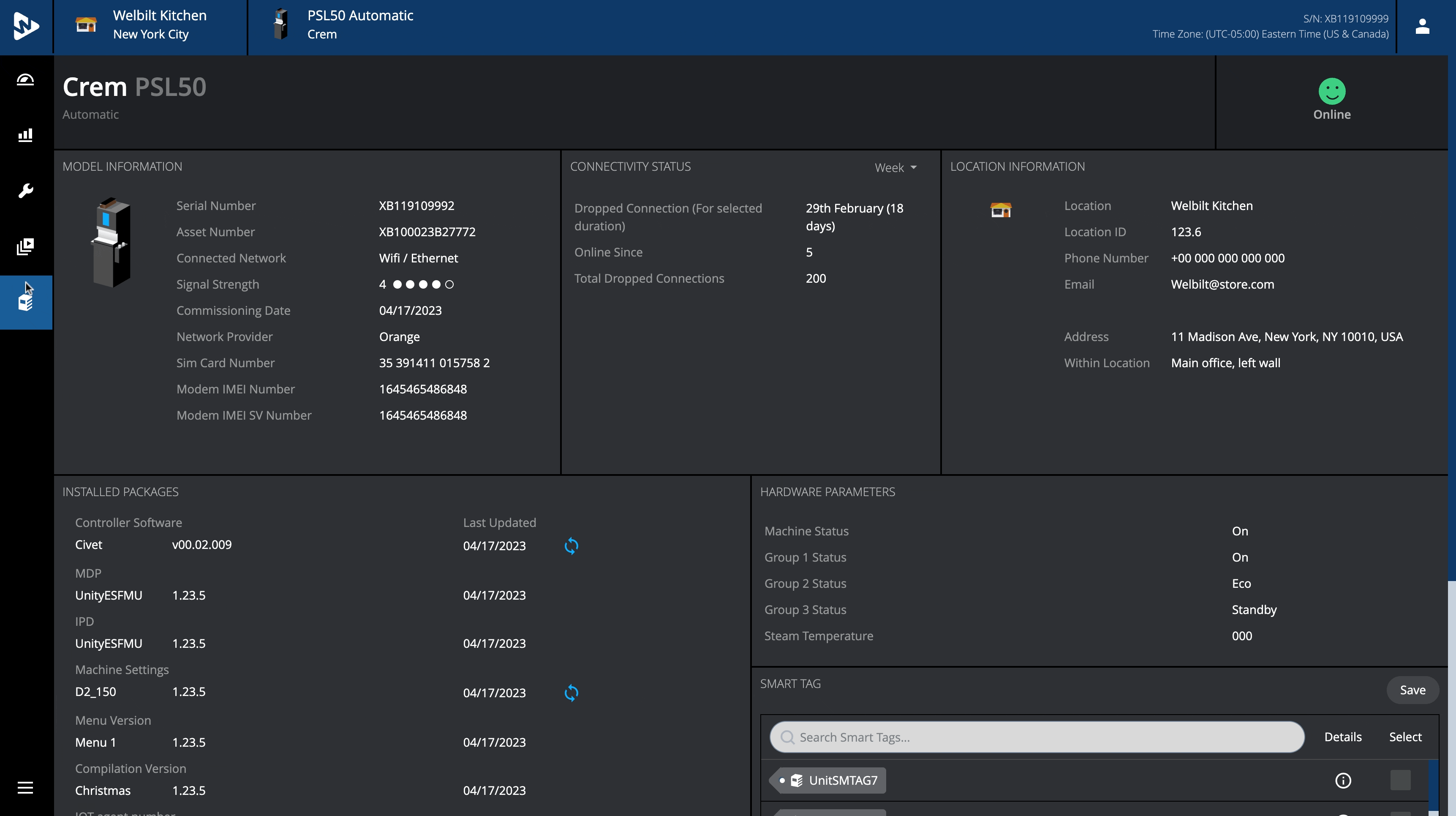
Cluttered UI
Currently, SmartTag doesn't have an edit button. This means that users have to contact IT Support to change SmartTag settings or exit from transfer management and go into the settings menu for further revision.

Hard to track information
End user had to call customer support in order to manage smart tag and things were engineer-driven terminology not for the day to day user.
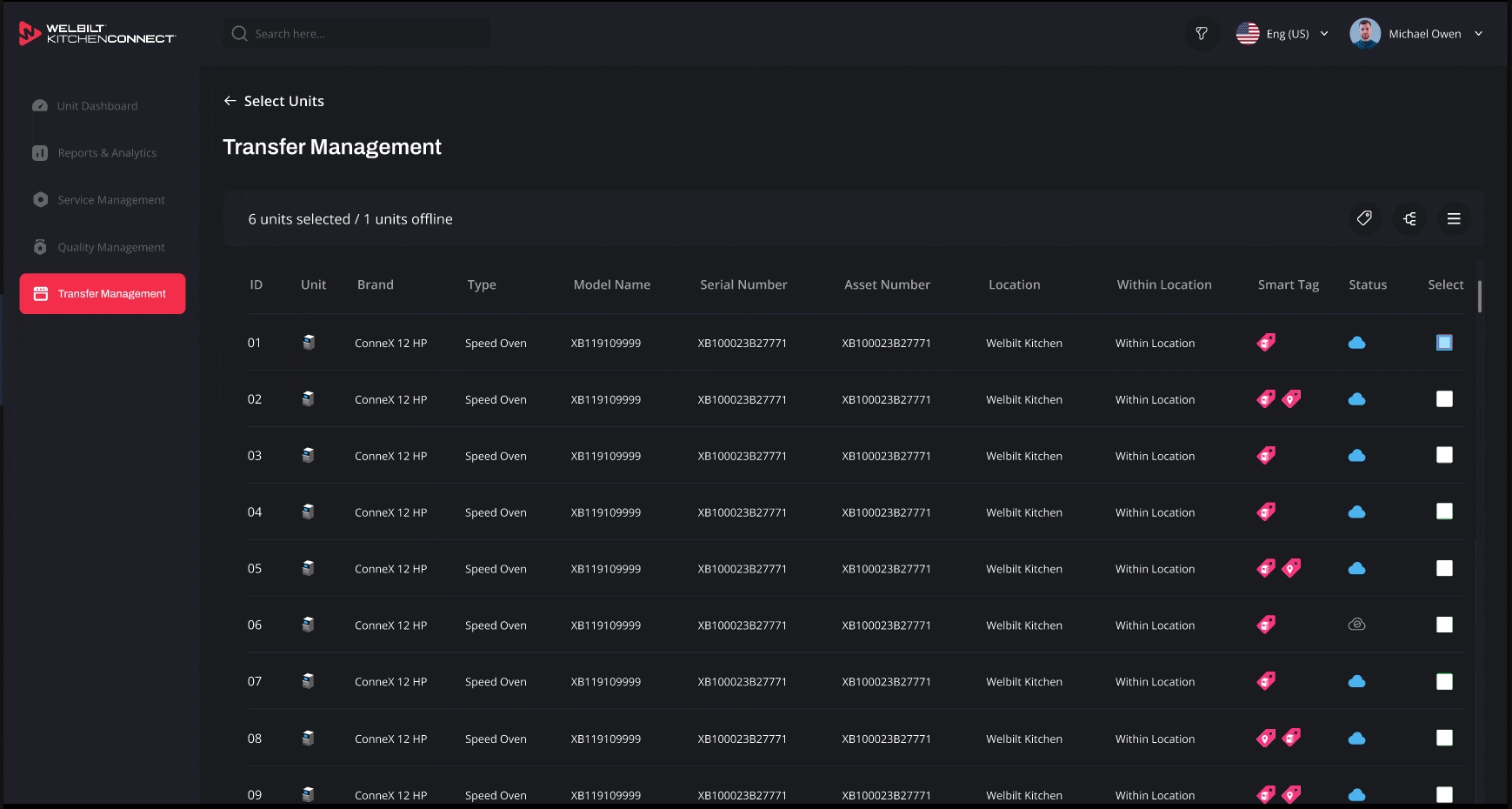
Streamlined UI
An "Add New" option was added in the edit setting, which helps make inventory tracking, food safety, and equipment maintenance more efficient. It makes it easier to schedule maintenance tasks and reduce downtime due to unexpected breakdowns. Reduced equipment failures by 40% through improved system design and proactive monitoring features

Faster Tracking
The user can edit and add new smart tags whenever they want. They can also check the information about who created it and when it was last edited.
I reduced tracking time from 20minutes to 15 seconds.
BREAKING DOWN THE PROJECT
Software updates during downtimes
Software updates provide security and customization of the units. Manufacturers can customize software updates to suit their specific hardwares and user requirements. This adaptability allows for tailored features, functionality and power efficiency: Firmware can be designed to manage power consumption effectively, prolonging battery life in portable devices.
Unclear Error Code and Next Step
The current page doesn't show what went wrong and how to fix the issue, so users don't know what to do or whom to contact. Identifying the problems takes them a great deal of time, and they need a clearer, more detailed explanation.


Lack of Clear Information in Notifications
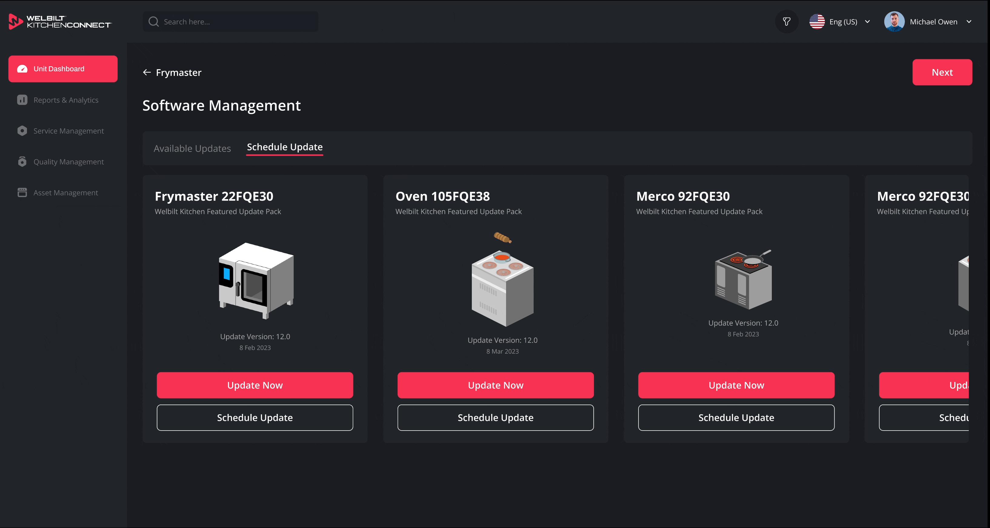
Simplified Task Flow
Software firmware management can update the issues themselves. From a user perspective, unnecessary jargon was simplified, and users could download firmware to their store anytime without reaching out to IT Support.

Enhanced Notifications with Visual Cues
To enhance the visual clarity and accessibility of the Update Status dashboard, I prioritized usability for all users—especially those with color vision deficiencies. By redesigning the interface to convey critical information through multiple visual cues, not just color, I significantly improved the dashboard's readability and effectiveness.
As a result, the new design has the potential to reduce customer care tickets from 3,500 to 1,500—representing a projected 60% increase in productivity for the customer care team.
Notifications offer no clear solutions. Users must contact IT Support and endure long wait times.
PROTOTYPE
This is the link for the Scoreboard. If you would like to see other clickable links, please contact me.
RESULT AND BUSINESS IMPACTS
Key Metrics

During the third user testing, I discovered that user satisfaction improved from 53% to 75%.
Although I still see how I can improve potential usability to achieve the highest standards
01
Successful click through rates are 78%
02
User impression rates are 83%
03
Support tickets related to filters dropped by 40%
DOCUMENTATIONS
Seamless Design team Transition
I envision a roadmap for the team to pursue enhancements that will further elevate the kitchen dashboard’s capabilities, ensuring continued growth and success even after my departure
-
Documented new components (cards, charts, filter dropdowns)
-
Added to the company’s design system for reuse across products.


CONCEPT DESIGN
Executive Insights On-the-Go
This B2B dashboard used to live on big monitors — now it fits in your pocket.
-
Most B2B dashboards are desktop-first — making it hard for busy operators or executives to monitor real-time insights when they're on the move.
-
What if we could shrink that complexity into a sleek, pocket-friendly dashboard? Sometimes, the best decisions happen in the elevator.
KPI Dashboard, Smart Tag, and Audit Trails
RESULT AND IMPACT
Business Impact?
01
Kitchen managers saved 85% of time and reduced errors
02
Faster tracking led to reduce 40% equipment failures
More intuitive system led to increase 60% adoption rates
03
04
Less time wasted meant 70% better productivity and increase 20% revenue retention