Senior Product Designer | Enterprise SaaS

THE CLIENT
The Client: Greenpeace

Role & Team
UX/UI Designer & Researcher
collaborated with Greenpeace’s digital advocacy team, copy writer
to revamp their campaign engagement flow.
The redesign aimed to increase petition sign-ups and donations by creating a seamless, emotionally resonant user journey.
Timeframe
2022
Company
Greenpeace is an independent global campaigning network and known for their direct actions.
Greenpeace Malaysia works to protect the environment for a safer future and a liveable world.
Web Application
THE BACKGROUND
Donation revenue is dropping year after year
Greenpeace faced a decline in user engagement for their mobile donation campaigns. The goal was to redesign the campaign landing and donation pages to improve clarity, emotional appeal, and conversion by 10%.
-
60% of the target donors are at least 35 years old or olderI was hired to figure out why people don’t want to donate.
-
Revenue is falling down year by year
-
The 25-34-year-old bracket has the highest population but the smallest donation segment
-
Women in the 25-34 age group represent 24% of the 'Inactive' or 'cancelled' donors

THE PROBLEM
How do we modernize the experience without losing Greenpeace’s mission and voice?

Why aren’t younger users contributing?
Understanding the barriers and discovering ways to increase donations from this group — without alienating existing donors — was essential
Business Pain Point: Declining donations from younger users and bran consistency and modernization conflict. Younger audiences might be less likely to donate or become recurring supporters.
Conducted in-depth qualitative research to explore solutions iteratively — gathering feedback, discussing insights, and working collaboratively to address the problem
User Pain Point: Lack of trust and limited engagement. Users may worry about where their donations go and whether they truly make an impact. Also, the website and content might not connect deeply with younger audiences, leaving them feeling detached.
COMPETITIVE ANALYSIS
4 NGO Websites Do the Following Better
I investigated payment method issues and analyze non-governmental organization finance reports from authority websites and realized this was a bigger issue than a variety of payment methods. Greenpeace needs to ensure transparency and public accountability in its campaigning, fundraising and financial management practices

WEBISTE ISSUES (BEFORE REDESIGN)
Overview of 2 Research Findings

01
Payment Method Issues
Transparent payment methods foster trust and open communication.

02
Information Architecture Issues
The content gets lost in difficult-to-read typography; your customers cannot read it and click away.
01 WIREFRAME (AFTER DESIGN)
Flexible Payment Options for Every Donor
How Do You Attract Young Donors to Your Nonprofit Organization?
Choose your comfortable amount of donation
Diverse payment methods, including debit card, bank transfer, and cash delivery
It provides each step of the donation process and the diversification of the payments.
Concept Design: Flawless Donation Process
02 WIREFRAME AFTER DESIGN
Revised Content for Better Information Architecture
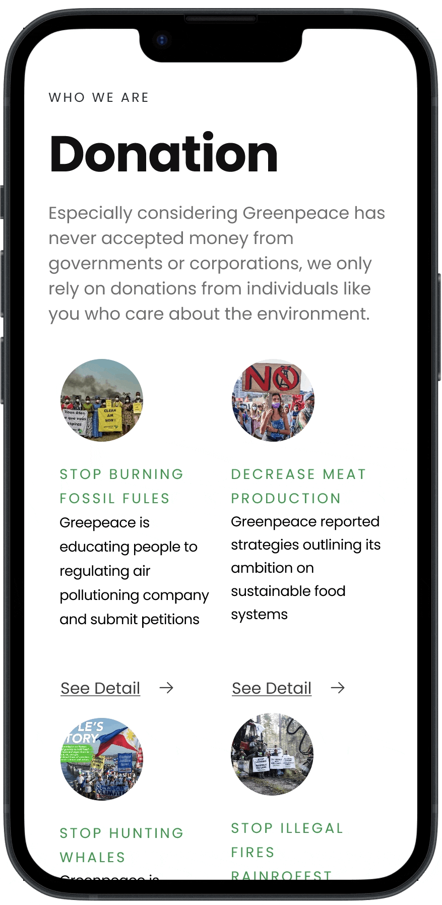
Raising Awareness, Empowering Action
Valuable volunteers who know how to leverage critical social media channels are needed
Supporting the need for supplies for volunteers and locals.
Getting people involved is a surefire way to get people to remember your organization
Restructuring Information Architecture is like putting puzzle pieces together. Every piece fits together to create robust brand awareness
The history of Greenpeace engages audience with how we can move forward on environmental issues

Concept Design: Volunteer Page
PROTOTYPE

Click any devices on the top. It will connect you full Figma file to review
RESULT & BUSINESS iMPACT

The redesigned campaign page increased petition sign-ups by 42% and boosted donations by 17% within the first 6 weeks post-launch
Increased Awareness & Search Visibility
CONSIDERATION
My Personal Learnings
Design & Research
Product
Engineering
INQUIRIES
Get In Touch
For more work inquiries, or grab a coffee, email me at rachel.cho5257@gmail.com